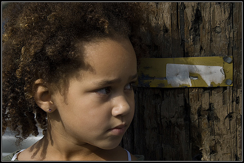
I have a backlog of Beauty Dialogue posts to write, but this morning I woke up in Taos to find the world covered in snow and suddenly there is only one (click to see her larger)…

Archive for blogging
My friend Fletcher (has a nice ring to it, doesn’t it?) started blogging again after several months of hiatus (or neglect, take your pick); check out the new Fletcher’s Blog. Fletcher’s a digital artist with a keen eye for the bizarre and the wonderful and I think you’ll enjoy his work, especially if you’re partial to street photography and astute political commentary.
Here’s one of my favorites from his Carnaval photo shoot:
One of the reason I choose to use TypePad is their obvious care for beauty – from the viewpoint of a designer it is very easy to make a beautiful blog with this software, and from a user’s standpoint, the interface has a refreshing clarity and ease.
Even their website was clean and beautiful – and I say was even though
it’s still far better than most, but I must admit I prefer the old
design. I loved the evocative image of an orange among apples and the featured
blog right up there on top – as a TypePad blogger, it made me feel I
could be "discovered" at any moment. Now that piece is much further down the
page, "below the fold" under some standard promotional copy that gets
VERY old when you see it every day.
But to my eye, the winner of the online design prize goes to Google.
The ultimate in elegant simplicity, what else could a weary-eyed
designer like myself, visually exhausted by the crowded excesses of the web, possibly prefer for my browser’s home page?
Even now with all the bells and whistles I’ve added to Google suite – GMail and Blogger, Google
Analytics, Google Calendars and widgets that show daylight patterns
across the world – they tuck away nicely in tabs, preserving that clean open search
page design. I love the relief of its white space and never get tired of the
classic logo, kept fresh and surprising by the variety of seasonal
decoration (although today’s depiction of Lego’s 50th anniversary makes
me suspect they’re accepting product placement payments, and that
tends to make them less attractive).
What delights your eye? Any favorite examples of online design to share?
I listened to a Skypecast sponsored by Typepad today, with Seth Godin. I knew him briefly in my days working with Fast Company, read most of his books and have always liked him. He didn’t disappoint me this time either, declining to pitch his new book Small is the New Big by saying if we were interested we would go to his blog and buy or download it. But what he did say warmed my heart.
His message was simple. He talked about blogging being a force for authenticity in the world,
citing the fact that one couldn’t really lie consistently day after
day, and eventually the real ‘you’ would be known. And once we let
ourselves be known, people begin to relax and others can’t help but tend to love us.
In answer to someone’s question about the best, fastest way to build a massive readership, he said that it didn’t really matter. If we were telling the truth to 5 people, it was far better and more effective than talking crap to 50,000. He gave a big boost to all the small bloggers who were there, and prioritized the sharing of what is real and true in our lives rather than slavish devotion to some supposedly effective business strategy.
You can listen to it yourself here.
Subscribe
Search
 weDialogue
- Gifts from the Art of HostingIn ending a year that was so challenging for so many, I want to start this new one by expressing my appreciation for the many gifts I have received from the Art of Hosting community. (Art of Hosting is an international network of participatory practitioners ... Read More
Who’s Visiting?

Copyright © 2026 All Rights Reserved


Welcome!