I was reading something in Chris Brogan‘s blog the other day on blog design, a solid informative post about basing each design decision on its congruence with your blog’s intended use. At last count this piece had drawn 61(!) comments from his readers, many of them appreciative of Brogan’s suggestion to use a thinner header to take full advantage of valuable page "real estate".
I wrote a long comment myself, in part promoting the idea of a more expansive banner, because sometimes an image is as valuable (if not more so) as anything else you could say. This fact may not be immediately apparent in the largely left-brain logic of the marketplace, but it is no less true. Daniel Pink’s A Whole New Mind gives a wonderful exposition of why right-brain creativity is an increasingly important component in today’s world.

One of the great things about a blog is how easy it is to change it, and I tend to be continually tweaking and fine-tuning my "look and feel" and sidebar content. This new banner, for example, is a radical departure from what I’ve done here in the past.
Even though it intuitively felt right, I must admit at first I was nervous about using black in the beauty dialogue color scheme, since I usually have a more literal focus on light. Then I saw these lines from Anam Cara, by John O’Donohue, and knew I was ok:
"We need a light that has retained its kinship with the darkness … All creativity awakens at this pivotal threshold where light and darkness test and bless each other. You only discover balance in your life when you learn to trust the flow of this ancient rhythm."
The power of visual language is undeniable, perhaps because it speaks not only to our conscious, logical brain, but also to our unconscious, poetic intuition and imagination. Like Pink, I believe that gaining intuitive fluency is one of the most important skills you can develop, as a designer and as a human being.
But what do you think? What are some of the design decisions you have made and why did you make them? Where does your own balance lie between logic and intuition?


I think I must be more of a “content dictates form” type of guy. I think having guidelines (like “use a thin header to save valuable real estate”) is useful, but the rules, we’re often told, are made to be broken. 🙂
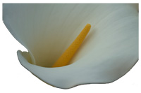
You’ve broken the rules spectacularly with the large header, but why not? This is a not a tech blog, it’s not about stock tips or politics – it’s the “BeautyDialogues”! It seems only appropriate that a reader who lands here would be greeted by a large beautiful flower. What better way to start a dialogue on beauty?
Context is key for making choices like this. For many other blogs (I might even say most), this header wouldn’t work at all. For “BeautyDialogues”, it’s right on.
I’m with d. Match it to the kind of audience and flavor you’re seeking to foster. That’s a beautiful header you’ve got up there. : )
Thanks for the compliments, guys! 🙂
Bizarrely, d, this IS very much a blog about technology, at least sometimes, but you’re right – I’m writing from a particular perspective that is different from most “tech blogs”, and so my design needs are different.
You are both spot-on. Good design relates directly to the context in which it is being used. In blogs and websites, like most other communications, your intended audience has everything to do with your design decisions.
Hi Amy – I am with you, completely, on this and will quote you in a text I am writing on culturing sustainability.So much of living unsustainably seems to me to be about the abjection of the intuitive, the imaginal, the darkness, the inhuman and the unthought yes! of beauty.
Brilliant, Caffyn! Send me a copy of your text when you’ve finished, will you? Thanks so much.
While this has really nothing to do with blog design, it IS about beauty–and design.
My husband and I just returned from the Western Caribbean where one day we visited a Mayan site in Belize. It’s called Xunantunich (shoooNANtoonitch), a temple site that involved a 7 1/2 hour bus trip from the coast. Air conditioned, thank the Goddess of art and beauty, Ix Chel!
One of the many good things about this particular site is it’s so remote they haven’t needed to rope anything off because so few tourists find it–so naturally, I put my purple crocks to the steps and up I went. Never looking back. Only looking at my feet, way too big for the width of the stone step. Such tiny feet they had.
Hot! 90 degrees! Once at the top (whew!) you were way above the tree line and I could see Guatamala–assuming I was actually facing the right direction.
Later (and here’s the real point to this) I was talking to an Indian man about temples and steps and how I noticed the riser part of the steps at first was so high–I mean you had to lean into the stone to take what was a huge step up and then closer to the top, there wasn’t as much space between the steps and you could just easily step up. He said Indian temples are designed like that as well. It’s so you enter the space with humility–you have to lean in and bow down as you begin.
A worthy goal for any design project I suspect.
Karen
Karen,
It’s so good to hear from you again!
What you describe has everything to do with the essence of all design! You are SO fortunate to have had this experience, and thanks so much for sharing it with us here.
Amy