Image

Author Archive for Amy Lenzo – Page 27

Michael Katz

I get a LOT of e-newsletters but there are only a few I actually read. This small list includes Jeevan’s BK Communique, which I wrote about the other day, but another comes from Blue Penguin Development‘s Michael Katz, who coincidentally helps people learn how to write these things.

Penguin_standing_2Michael really understands the secret of a great e-letter, which is – in a nutshell – to claim your reader’s immediate attention by focusing on what THEY want to know, rather than what you want to tell them.

Cultivating a distinctive personal style that’s aligned with your purpose, as Michael does, is also important to e-marketing success. Plus he’s absolutely hilarious, which never hurts.

Michael has been a guide to me for many years now, and if you’re thinking of starting an e-letter of any kind (and imho keeping in regular contact with your audience is essential to any successful communications strategy), I can’t recommend anyone
better to study and learn from.

My Friend Fletcher

My friend Fletcher (has a nice ring to it, doesn’t it?) started blogging again after several months of hiatus (or neglect, take your pick); check out the new Fletcher’s Blog. Fletcher’s a digital artist with a keen eye for the bizarre and the wonderful and I think you’ll enjoy his work, especially if you’re partial to street photography and astute political commentary.

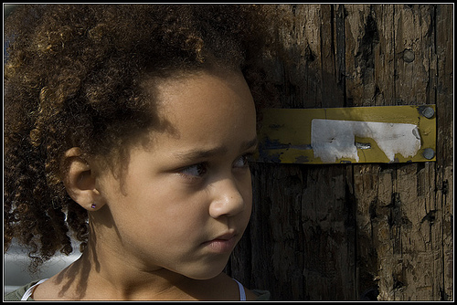
Here’s one of my favorites from his Carnaval photo shoot:

Carnavalchild

Welcome to the Beauty Dialogues!

The Beauty Dialogues is here to illuminate the beauty of this world – not just the beauty of form, but also the patterns of essential wholeness that go beyond the visible.

Wholeness dissolves the illusion that life and work are separate so sometimes I write about design and the language of online communications, but it’s always about what, to me, life looks like through a beauty-lens.

Design Deliberations

I was reading something in Chris Brogan‘s blog the other day on blog design, a solid informative post about basing each design decision on its congruence with your blog’s intended use. At last count this piece had drawn 61(!) comments from his readers, many of them appreciative of Brogan’s suggestion to use a thinner header to take full advantage of valuable page "real estate".

I  wrote a long comment myself, in part promoting the idea of a more expansive banner, because sometimes an image is as valuable (if not more so) as anything else you could say. This fact may not be immediately apparent in the largely left-brain logic of the marketplace, but it is no less true. Daniel Pink’s A Whole New Mind gives a wonderful exposition of why right-brain creativity is an increasingly important component in today’s world.

Lily_white
One of the great things about a blog is how easy it is to change it, and I tend to be continually tweaking and fine-tuning my "look and feel" and sidebar content. This new banner, for example, is a radical departure from what I’ve done here in the past.

Even though it intuitively felt right, I must admit at first I was nervous about using black in the beauty dialogue color scheme, since I usually have a more literal focus on light. Then I saw these lines from Anam Cara, by John O’Donohue, and knew I was ok:

"We need a light that has retained its kinship with the darkness … All creativity awakens at this pivotal threshold where light and darkness test and bless each other. You only discover balance in your life when you learn to trust the flow of this ancient rhythm."

The power of visual language is undeniable, perhaps because it speaks not only to our conscious, logical brain, but also to our unconscious, poetic intuition and imagination. Like Pink, I believe that gaining intuitive fluency is one of the most important skills you can develop, as a designer and as a human being.

But what do you think? What are some of the design decisions you have made and why did you make them? Where does your own balance lie between logic and intuition?